Almost every person takes for granted how a grocery store is built. For most people, a grocery store is just a place to replenish items they need for their homes. When someone needs milk, they go to the grocery store to buy some. When someone needs toilet paper, they go to the grocery store to stock up once more on this bathroom product.
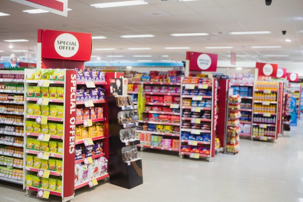
But what most people don’t know is that once you enter a grocery store, every detail in it is designed to coax you into buying something. If you’re going to operate a grocery store, aside from getting a grocery POS system, you should know the secrets to why a grocery is laid out like that.
They hook you in
The strategy of most grocery store owners is to hook you in as soon as you enter those doors. They do that by placing items near the entrance that can produce a wonderful sensation to the customers. See if your local grocery store is also implementing this strategy: Almost every grocery store places their bakeshop, coffee shop, flower shop, or even a mini food court near the entrance. Experts in laying out grocery stores say that they do this because they want customers to enter the establishment having a good feeling right away. A good smell will definitely put a smile on someone’s face. Another reason for this is that people who are more jovial are more likely to purchase something than those who are indifferent.
If you plan on putting up a grocery store or if you’re remodeling your store, make sure that you put your bakeshop or coffee shop near the entrance. Before you know it, people will be lining up to enter your store because of the smell.
They pull you in further
After you pass through the entrance and the coffee shop, the next items that you will see are the fresh fruits. They are not placed near the entrance because a lot of people eat fruits. They are placed there to pull you further into the store; bright colors are said to attract people.
According to psychologists, bright colors can attract people. If you see a monochromatic image and a painting filled with vibrant colors, you’re sure to pay attention to the colorful painting more than the monochromatic image. Also, the images of fruits in a grocery store can easily make any person hungry.
Product placement is science
In most grocery stores, when a product sells well, it is placed in the middle of the shelves and nowhere else. That way, customers can easily grab them without having to strain their necks or bend their backs just to check the shelves for their favorite brand. Popular items are stacked in the middle of the shelves for easy access. They sell well because most people don’t want to strain themselves too much when they’re buying items in a grocery store.
Exits are far away

There is also a reason most grocery stores often place their exits far away from the entrance or they come up with a complex route leading to the exit. It’s because they want you to stay inside the grocery store so that you’ll buy more stuff.
If you enter a grocery store that is easy to get out of, you might buy only the item you need and get out right away. But if the exit is far away or you’ll have to pass through several aisles before you reach the exit, you might encounter some other items you don’t really need but buy anyway.


